Business finance app design challenge
The product design challenge that landed my job at myPOS Technologies.
About myPOS
myPOS is a fintech company that enables small and medium-sized enterprises (SMEs) to accept payments through various electronic channels: payment terminals, online and mobile.
The challenge
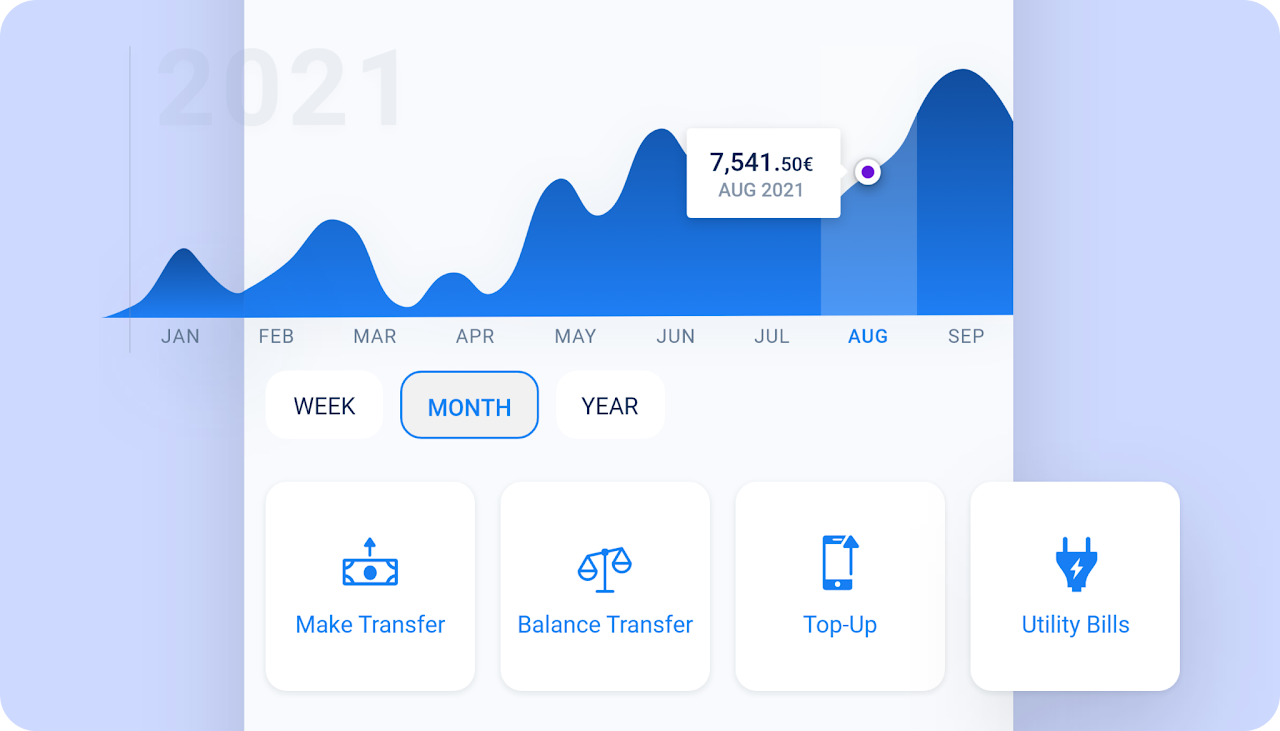
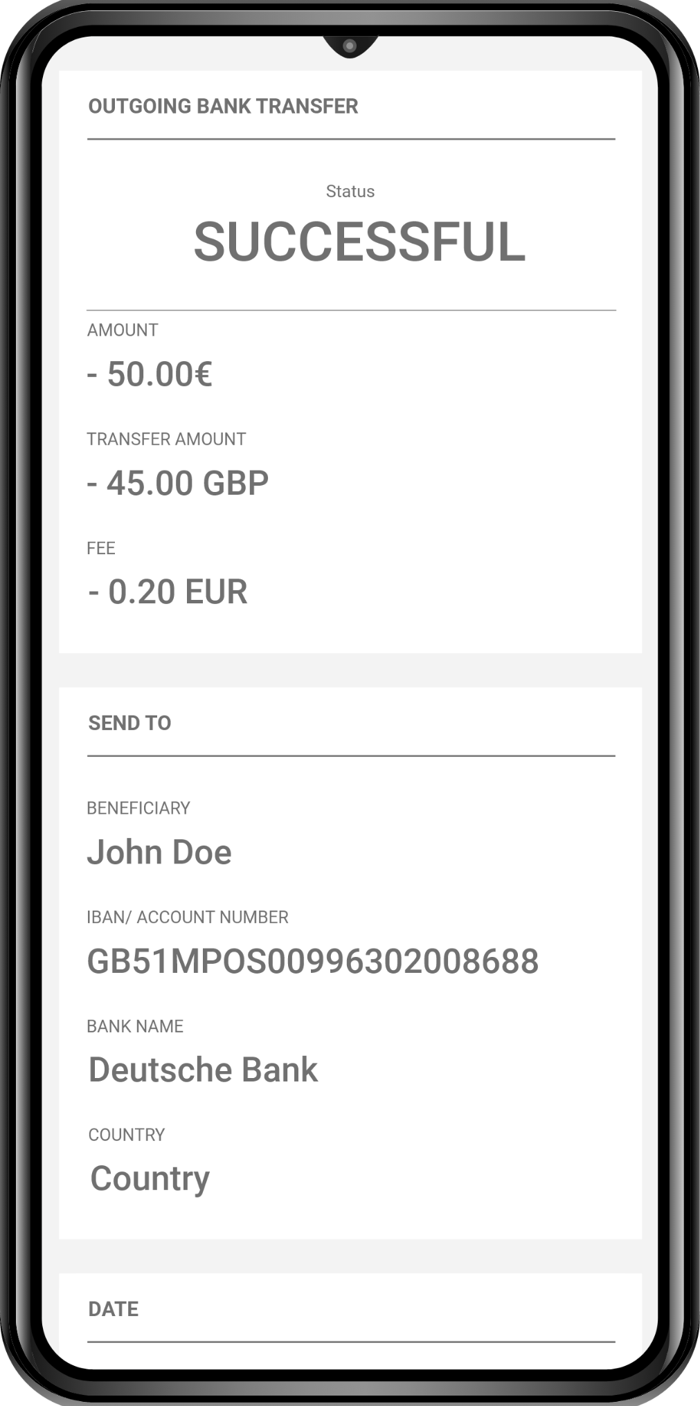
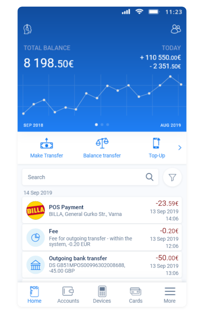
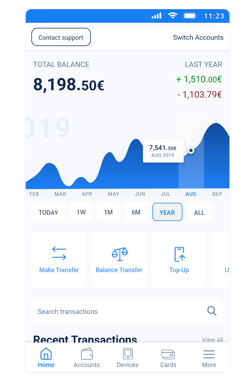
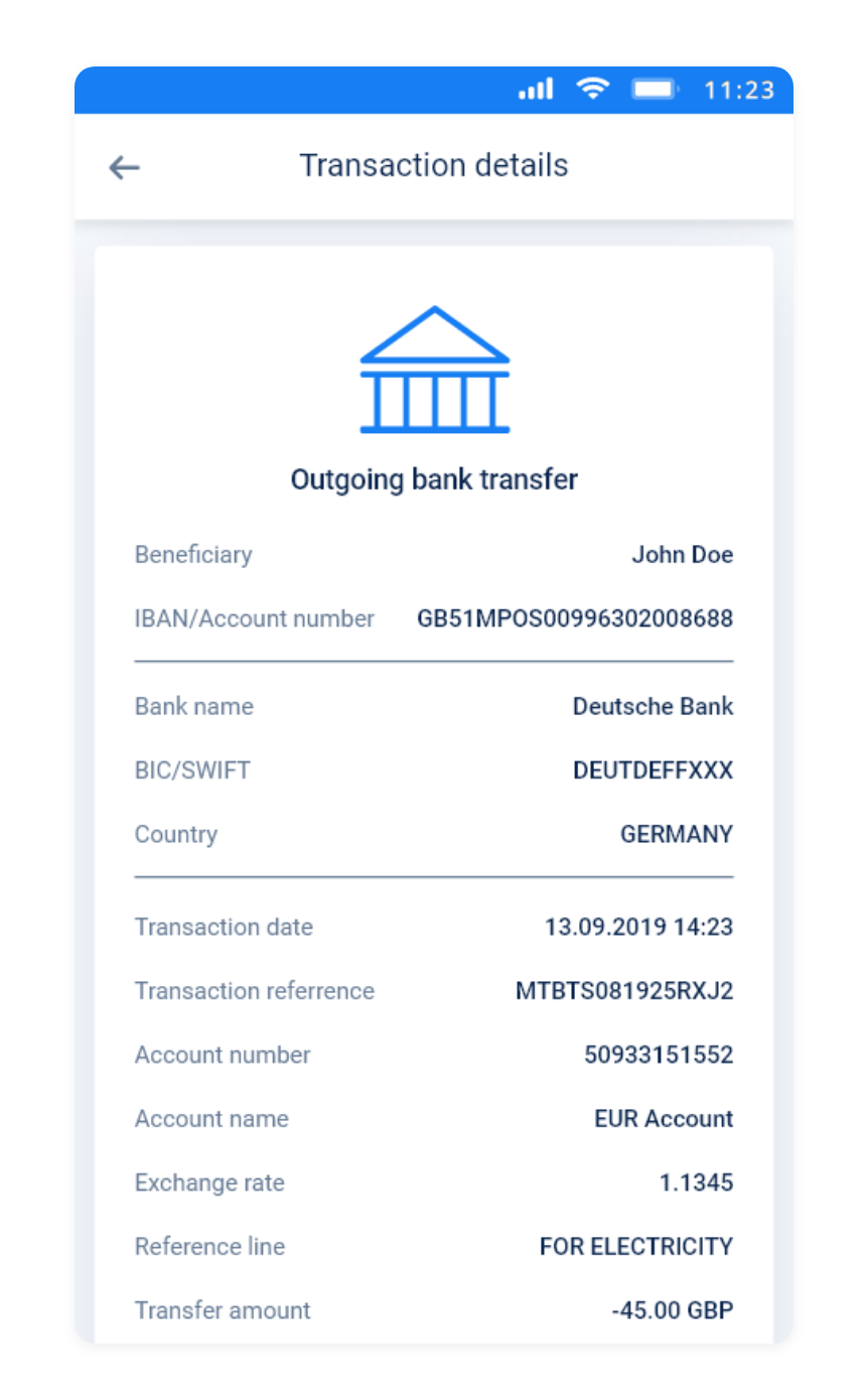
The challenge was to design a new improved version of the transaction details screen which was provided in a Adobe XD file along with the Home screen of the app for point of reference (Of course, I couldn't help myself and redesigned them both). The following paragraphs describe how the challenge was tackled.
Review of similar apps
After examined the provided screens and researched similar apps, such as Viva Wallet, Qonto, iCard, DSK Smart, PayPal, Revolut, CCBank Mobile App, m-Postbank and others. I consider the process of analysing how things function in similar products as quite important. I tried to review as many apps as possible in order to have a better understanding of various designs and flows. I spent practically an entire day reviewing and learning about the flows of various apps by installing and trying them, or watching videos and browsing images of their screens when not possible to get first-hand experience.
Secondary research
Based on the points identified in the previous two steps the relevant literature and research were reviewed for backing up the assumptions made in the previous two steps. Moreover, for guiding the upcoming user research and addressing common issues found in UX studies in relation to finance apps.
User research
The research was conducted with 6 participants (friends of mine which use online payment apps) and was separated in 3 different parts:
User interviews
Unstructured interviews were conducted. Some of the questions asked were:
- Why do you use online payment apps?
- What is your level of trust in such apps?
- What makes you choose one app over another?
- How often you use an online payment app?
- What is your purpose when reviewing past transactions?
- What information you look for when reviewing past transactions?
Card sorting
In order to refine the information architecture of the Transaction details screen, card sorting exercise was utilized. Participants were asked to organize the transaction details into groups and assign categories to each group. In total, 5 categories were formed. Then, they filled in a survey sorting out the categories by importance.
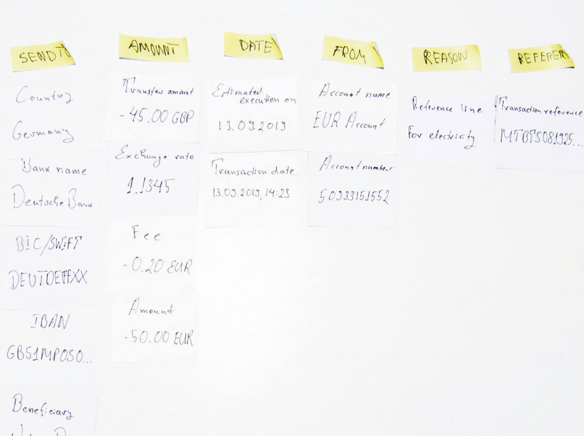
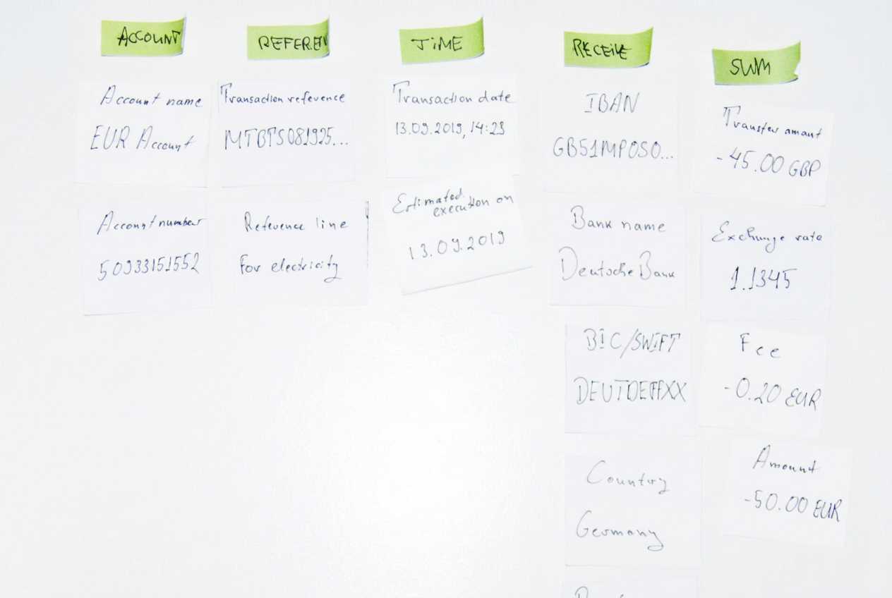
User review of current design
The participants were shown the provided screens, using Adobe XD's mobile app for more realist presentation, and they were asked to express their impressions.
Research results
Findings from the review, secondary research, and user research are summarised below using the SWOT framework.
Strengths
- Blue colour suits a finance app; 62–90% of people assess products by colour alone (Morton, 2019).
- Detailed, informative screens.
- Roboto font is readable and familiar on Android.
- Home graph is relatively clear.
- Transaction details screen avoids distracting elements, matching other payment providers.
Weaknesses
- Cluttered design; more white space would reduce visual noise and improve comprehension (Fadeyev, 2009; Bank & Cao, 2014). Users are comfortable scrolling on mobile (Fessenden, 2018; Collins, 2020).
- Tappable areas are too small; Material Design recommends 48×48dp targets with 8dp spacing (Google, 2021).
- Unlabelled icons increase cognitive load (Weinschenk, 2011); click-and-explore behaviour is more common in younger, tech-savvy users (Formanek, 2020), but business owners may include older, less tech-savvy users who fear mistakes (Bittner, 2019).
Opportunities
- Use colour to convey meaning (green for income, red for expenses).
- Add share/print options for transaction details.
- Promote "MAKE AGAIN" to a floating action button (FAB).
- Make the graph more interactive.
Threats
- Users trust established financial institutions more than new payment providers, increasing the burden to build trust through transparency, security communication, feedback, and error prevention.
Results from card sorting
Based on the card sorting exercise the following structure was build, sorted by importance:
Amount of Transaction
m = 5.3Sent to
m = 4.6Date
m = 4.5Sent from
m = 2.3Other
m = 1.5Note. m = arithmetic mean/ average
Designing solutions
Based on the findings from the research, four different solutions for the Transaction details screen were designed.
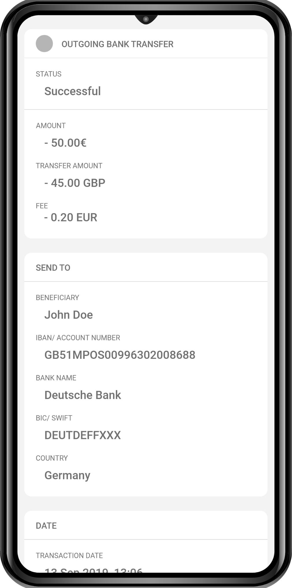
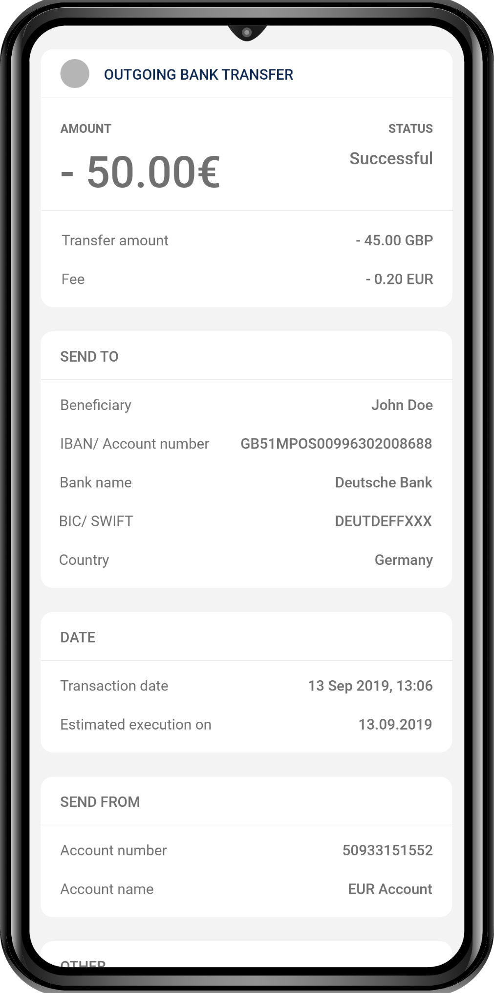
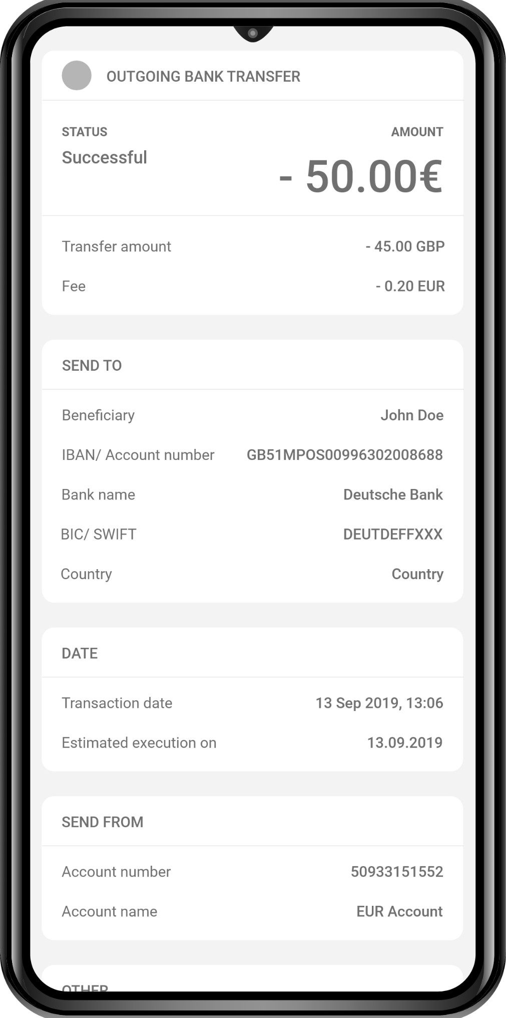
The different versions were evaluated, considering the findings from the research, the one which provided the most relevant, meaningful and consistent experience for the users (Version 4) was finalized into high-fidelity prototype.
High-fidelity prototyping
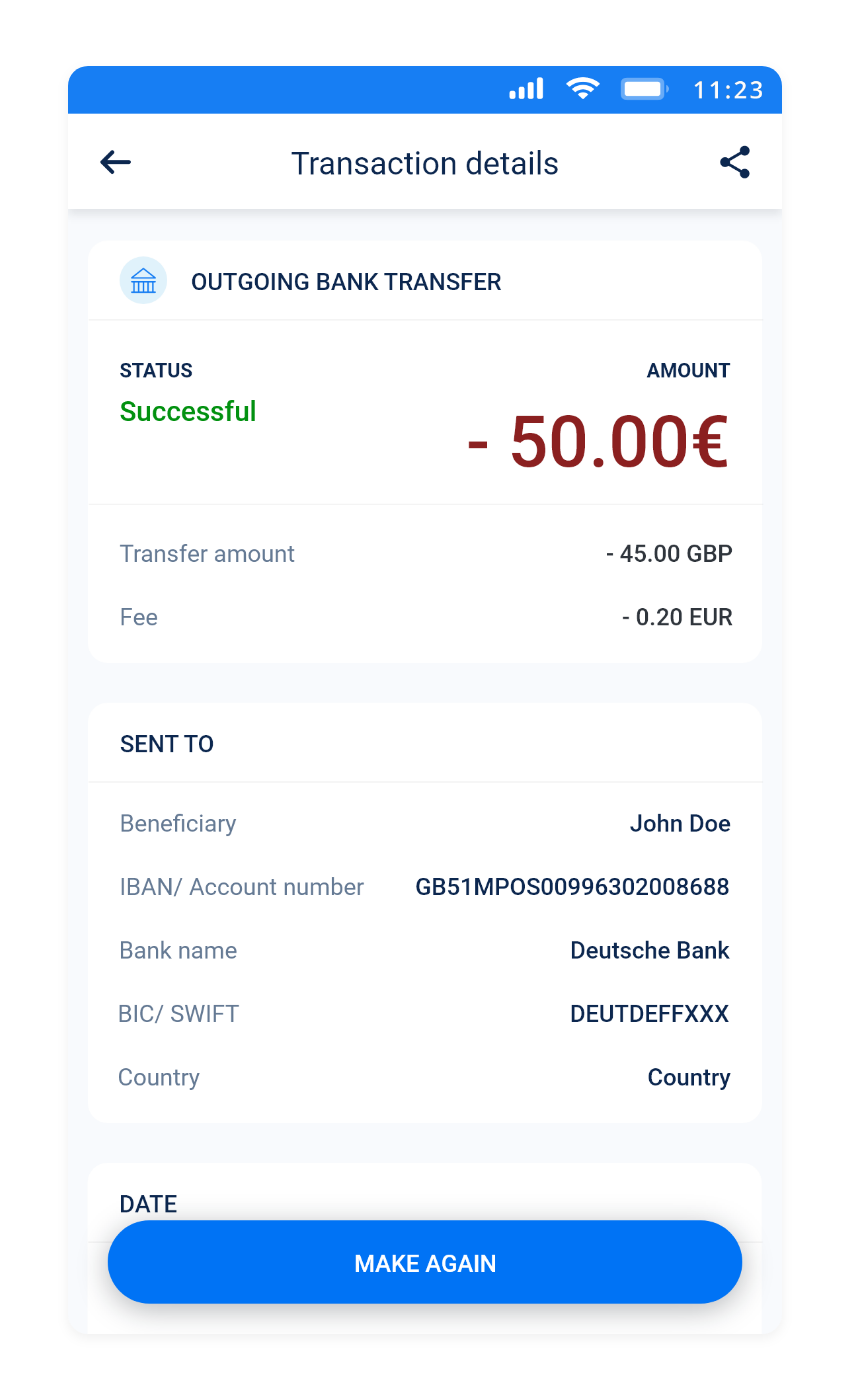
The following describes the changes from the original design and the rationale behind them.
Transaction details screen
Firstly, the Transaction screen as it is the focus of this design challenge:
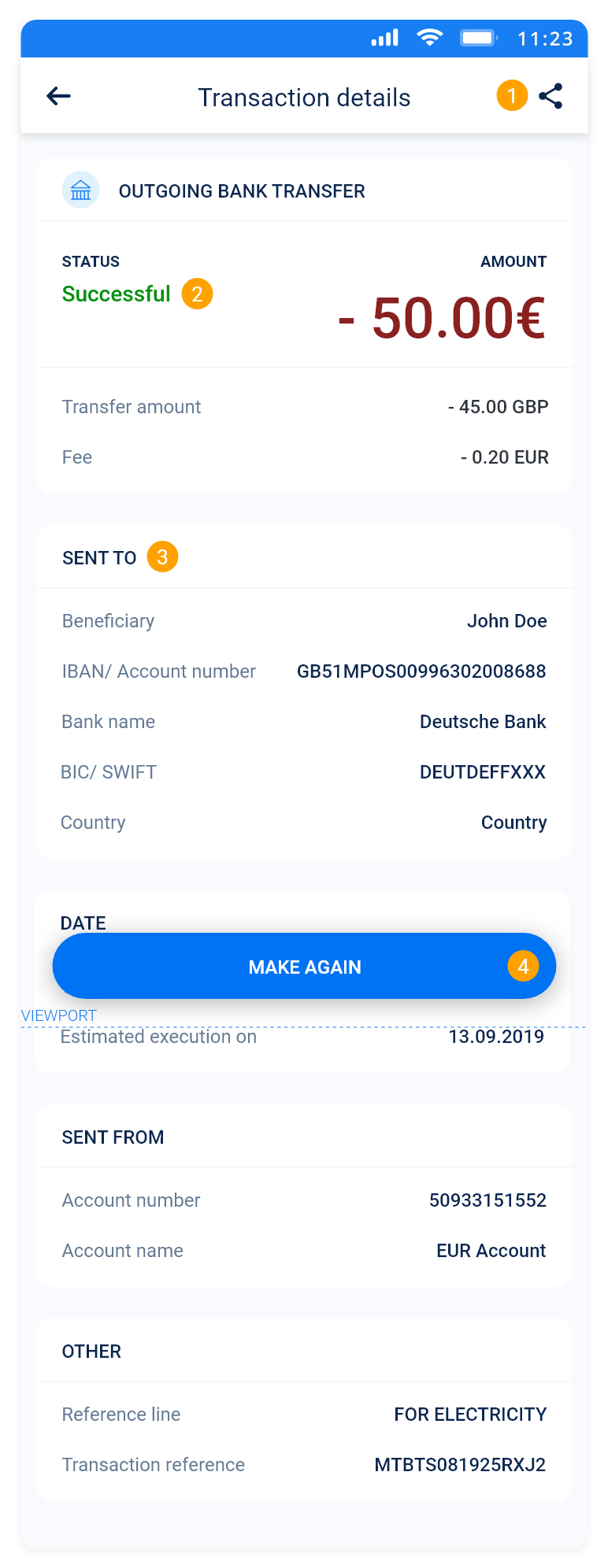
- Option to share transaction details was added (via social media, email, and print). Sharing options would also allow sharing transaction details easier with Customer Support, when a transaction problem occurs.
Furthermore, the design of the icon is the common one used for Android devices (I assumed that the app is for Android because the status bar in the provided file is for Android). It should be also noted that the back and sharing buttons are presented as icons and not labelled which contradicts with the statements made earlier regarding icons. However, in this case the back button and sharing button are so intrinsic to Android devices that they do not need labelling. Everyone using Android device is most likely familiar with the meaning of these icons. That being said, in respect to iOS devices its native buttons should be used. Alternatively, "More" buttons (three dots) can be used for all operating systems.
- Transaction status was added to communicate transaction's execution (Successful, Pending, Failed). If the status is failed, the reason for the failure and how the user can resolve it should be communicated.
- The information was fragmented and grouped into few categories to make it more scannable and "digestible" for the users. The Transaction details were arranged according to users' mental model established through user research.
- The button "MAKE AGAIN" was made floating action button (FAB).
Home screen
The overall UI was given more space to "breathe", and the tappable areas were enlarged for easier and more confident taps.
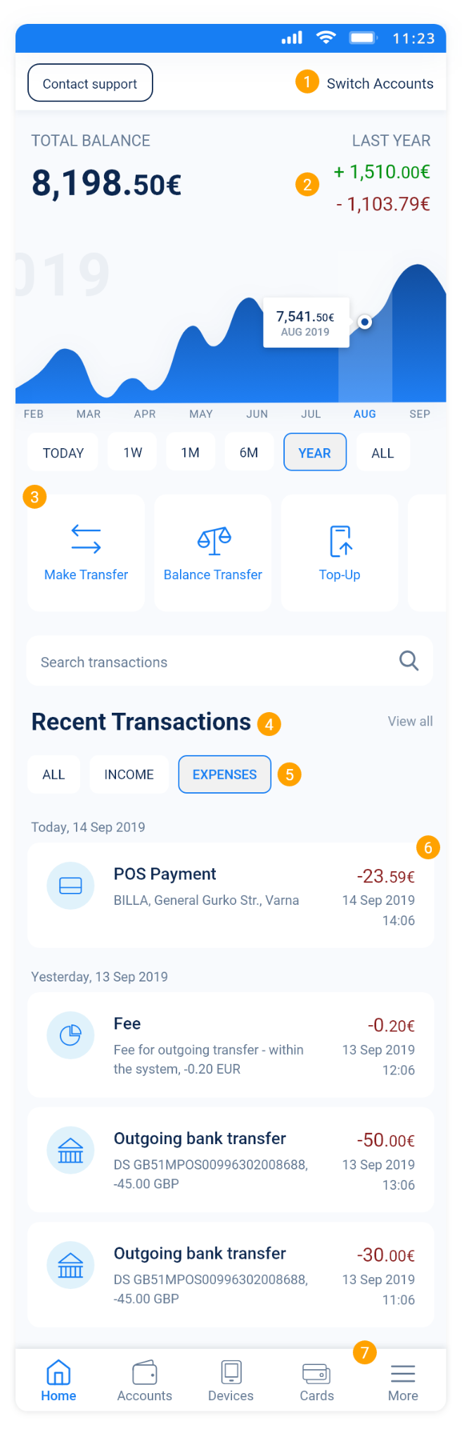
- Icons for support and switching accounts were substituted with labelled buttons to convey better clarity. Further, the navigation bar should be temporarily hidden when scrolling down for more immersive experience, and reappear when scrolling up.
- Today's transactions were made clearer by using colours.
The blue background with white text does not pass the contrast ratio test of at least 4.5:1, that is why it was substituted with white background and dark blue text which provides a far better contrast ratio of 14.1:1.
As a central piece of the home screen, the graph was designed to be more interactive, hence more engaging for the users.
- Main action buttons were enlarged, and hidden items were made accessible via horizontal scroll.
- The transactions displayed were labelled as Recent Transactions.
- The filter was made more discoverable which also allowed utilizing wider search field.
- Recent transactions were grouped by date, as "chunking" information together into groups makes it easier for assimilation.
Moreover, the containers of the transactions were enlarged to make them appear less cluttered and easier for tapping. The design followed the Material Design guidelines for three-line items in lists.
When there are no transactions to be shown (e.g., first use of the app), this area should be used as opportunity to help users get started promptly, therefore reducing the chance for abandonment. The average digital banking app loses around 70% of its users within a day after the installation, and 85% of its users within the first 7 days (Statista, 2020).
- Bottom app bar icons were simplified in order to make them more easily recognizable.
Preference testing
After completing my high-fidelity prototype, the two designs (existing and redesign) were integrated into Google Forms survey and send to 5 people (not the same tones hat participated in the use research) which were asked to indicate which design they preferred.
Regardless of the results, it should be noted that preference testing leads to a bias in favour of factors, such as visual design, or whether it seems familiar, or a personal preference (such as disliking a certain colour). In reality, people do not look at two versions and make decisions on which one they prefer visually (Travis, 2019). Hence, it would be more beneficial to be conducted a usability testing with interactive prototypes, or A/B testing with live versions of the app. These methods provide more significant data because they are based on user behaviour, instead of user preference.
Limitations
I wasn't able to use these particular screens of the app because access is provided only to businesses. Also, the provided XD file didn't contain any interactions besides the one related to the task. As result, this led to some design assumptions, for example, that the slider indicators, below the graph, change the timeframe that the graph displays. Likewise, this applies to the similar business apps that were reviewed.
Furthermore, the user research could benefit from more participants, also within the target group (i.e., business owners), and from different cultural backgrounds as the app is used across many countries. In this aspect, cultural design considerations also require further research.
Finally, as discussed in the previous section, more reliable testing was not possible because of time and resource constraints. Due to the same limitations more UX/ UI deliverables couldn't be produced.
Conclusion
I enjoyed working on this design challenge which gave me the chance to learn more about information architecture, user research, and visual design, and the company itself. I would be glad to see the redesign implemented and test it on live, as such kind of validation is critical in any project and far more unbiased.