Reimagining an existing complex user flow into a simplified one
What is universitaet.com?
Universitaet.com is a website which helps users find study programs in Germany, Austria and Switzerland, and provides an estimated chance for admission in a given university based on the user's academic achievements (GPA, degrees, certificates etc.).
Problem statement
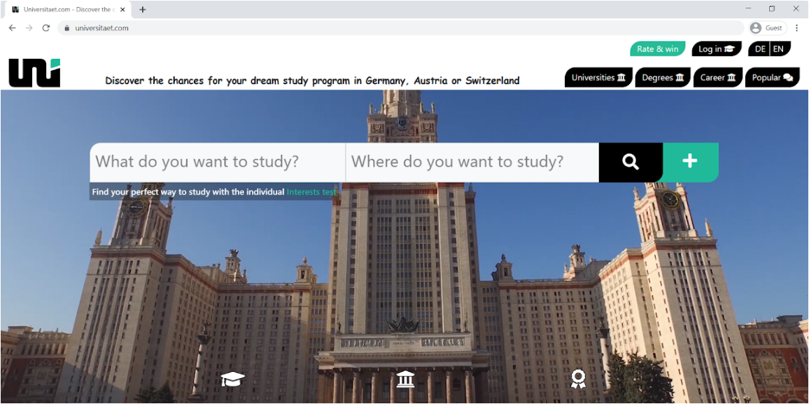
Although universitaet.com is a content-rich website, it didn't have a search field to allow free-text queries. It was hypothesized that due to the lack of a search field and other usability issues, the website didn't provide a fluid and intuitive user experience. Completing the most essential task of finding out one's chances for admission required excessive effort from the users.
Research
The research employed lab usability testing — participants performed a specific task scenario while being observed by a moderator. The task scenario was framed with the Job-to-be-Done (JTBD) framework:
"When [I visit universitaet.com], I want to [see my admission chances for Business Administration, MBA in European School of Management and Technology, Berlin, Germany], so I can [discover my chances for acceptance for this program]."
Five participants* took part in the usability testing. Each was provided with a laptop** with Internet connection, a printed task and a temporary email; the screen was video recorded and the moderator observed and took notes throughout.
* According to industry statistics, 5 participants surface around 85% of the problems in an interface (Nielsen, 2000; Sauro, 2010).
** The majority of the users visit the website on desktop devices, therefore a laptop was used for the usability testing.
Results and discussion
The usability tests indicated major usability and user experience issues. None of the participants succeeded in accomplishing the task within the allotted time. Four points of friction were identified.
1. Search function on the home page
In order to search for the study program, the participants attempted to initiate a keyword search within what were actually two separate dropdowns for selecting field of study and location. It took them more than a minute to realize that the white bar was not accepting a keyword query, and that they should instead select values from the dropdowns. The participants wrongly assumed that the dropdown lists complemented the search bar with suggestions.
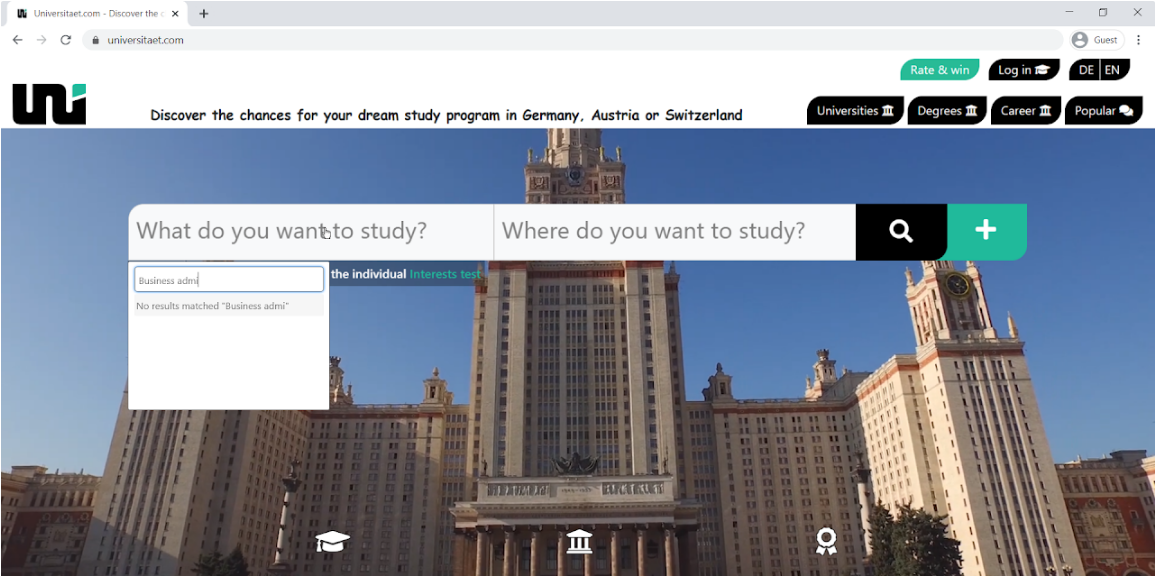
The dropdowns don't match users' expectations and cause setbacks. Replacing them with a search field that accepts random keyword queries would very likely eradicate this problem.
2. Lack of search field on the results page
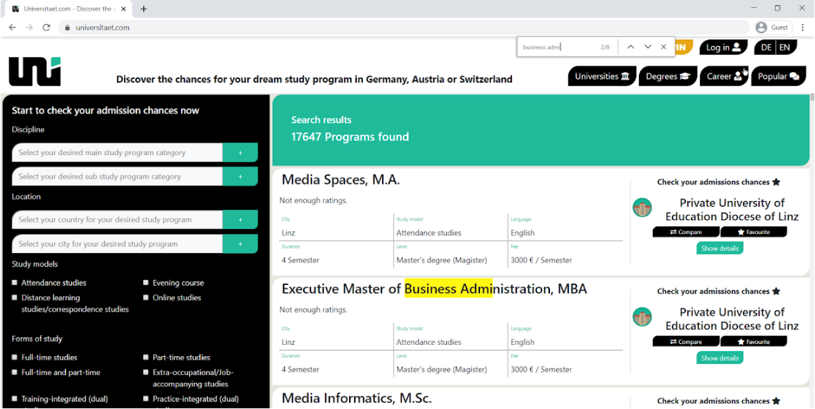
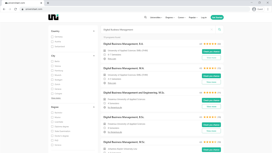
After overcoming the first issue, all participants proceeded to the results page and were overwhelmed by the number of results, because the filter they could apply on the home page was limited to field of study and city. Four of the participants tried to find the study program using the browser's Ctrl-F shortcut. But because the results are paginated (20 per page), they had to apply Ctrl-F on each page and quickly gave up. They then noticed the filters on the left side and used them to reduce the number of results — only three of the five participants found the given study program. A possible solution would be to place a search function in the navigation bar that is present on every page.
3. Poor visual hierarchy in relation to the CTA button
All three participants who found the study program intuitively headed to click the green "Show details" button instead of "Check your admission chances". One participant clicked "Show details" and was taken to a single study program page from which the only onward path is an external link to the university — meaning the user leaves the website and very likely won't return. The other two realized this and refocused on the "Check your admission chances" button which actually converts.
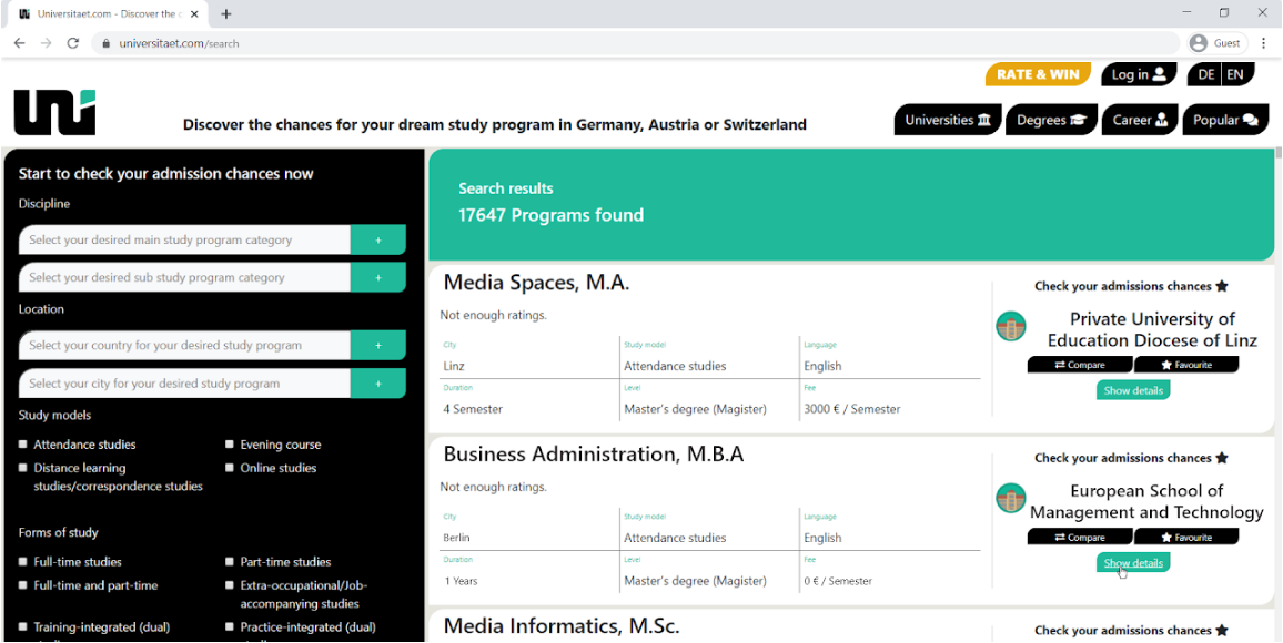
The CTA "Check your admission chances" is much less noticeable than the green "Show details" button. It needs to be more prominent, while "Show details" should be de-emphasized.
4. Password requirements not communicated
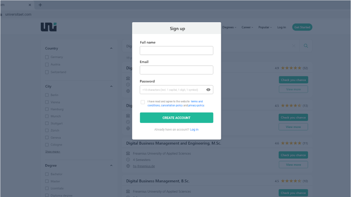
Two participants reached the registration step but failed because of the website's strong password requirements (10 characters, 1 capital letter, 1 digit and 1 symbol). The users were not informed about these requirements.
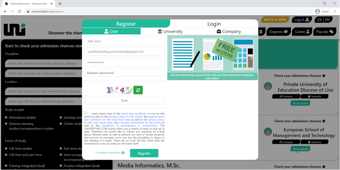
In addition, the participants weren't allowed to show/hide the password they were typing. The error message was displayed only after submitting the form and didn't communicate the reason for the invalid password format. Users are left to guess and repeat their efforts.
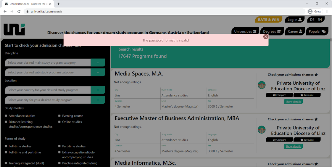
The solution: communicate the password requirements up front, allow showing/hiding the typed password, and validate inline — immediately, not after submission.
Design process
Based on the insights derived from the usability testing, design iterations were conducted. Using pen and paper, the process went through a variety of design solutions for each of the four issues.
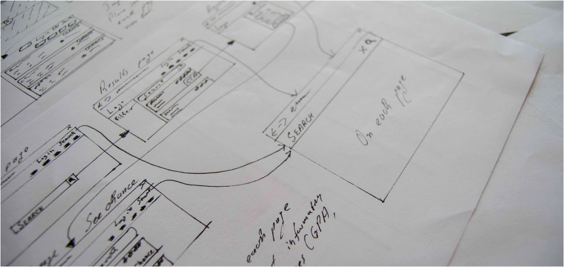
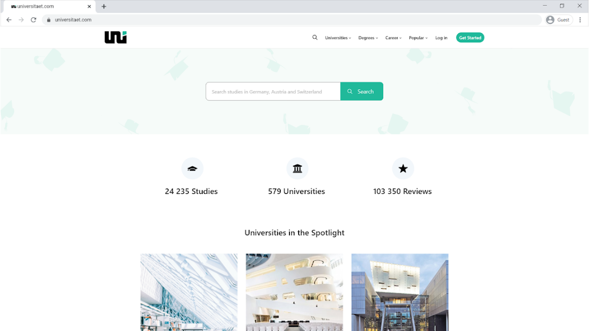
Afterwards, the best solution for each issue was prototyped in Adobe XD. Other improvements were made too, such as a clearer navigation bar and switching the hero media from video to image, which also improves loading speed.
Conclusion
Usability testing is a vital part of product development — it helps identify and overcome issues in design and reduces the risk of building flawed products, which in turn saves time and resources. In this particular case, four trouble spots were identified, confirming the hypothesized problem. Thanks to the user testing, concrete insights for improving the website were gained.
References
Nielsen, J. (2000, March 18). Why You Only Need to Test with 5 Users. Nielsen Norman Group.
Sauro, J. (2010, March 8). Why You Only Need to Test with Five Users. MeasuringU.